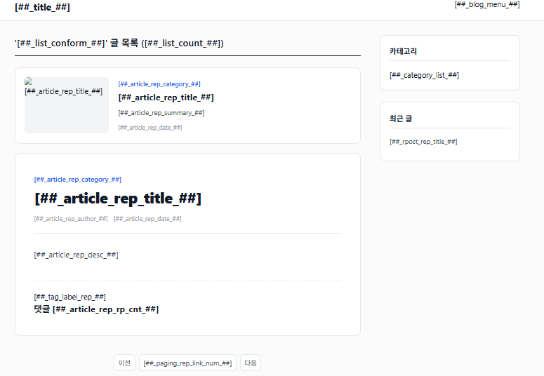
템플릿 코드
html 부분입니다.
<!DOCTYPE html>
<html lang="ko">
<head>
<meta charset="UTF-8">
<meta name="viewport" content="width=device-width, initial-scale=1.0">
<title>[프로그래밍] 티스토리 반응형 스킨 템플릿 만드는 코드 :: 아미아미아미</title>
<link rel="stylesheet" href="./style.css">
</head>
<body>
<s_tstory>
<div id="acc-nav">
<a href="#content">본문 바로가기</a>
</div>
<div id="wrap">
<header id="header">
<div class="inner">
<h1 class="logo">
<a href="https://donotmemory.tistory.com/">아미아미아미</a>
</h1>
<button type="button" class="btn-menu" aria-label="메뉴 열기">
<span></span>
</button>
<nav id="gnb">
</nav>
</div>
</header>
<div id="container">
<main id="content">
<s_list>
<section class="post-list-header">
<h2>'' 글 목록 ()</h2>
</section>
</s_list>
<s_article_rep>
<article class="post-item">
<s_article_rep_thumbnail>
<div class="thumbnail">
<a href="/3070">
<img src="https://blog.kakaocdn.net/dna/cGzLHC/dJMcacK7PkQ/AAAAAAAAAAAAAAAAAAAAAKpUCGJvw9zrS-X3sF7q1WGuDLWkO3_eFsAMoLsGmrRX/img.png?credential=yqXZFxpELC7KVnFOS48ylbz2pIh7yKj8&expires=1788188399&allow_ip=&allow_referer=&signature=JIcrQNd3R%2BrMR%2FOUqkI81G8WsUU%3D" alt="[프로그래밍] 티스토리 반응형 스킨 템플릿 만드는 코드">
</a>
</div>
</s_article_rep_thumbnail>
<div class="post-info">
<a href="/category/IT" class="category">IT</a>
<h2 class="title">
<a href="/3070">[프로그래밍] 티스토리 반응형 스킨 템플릿 만드는 코드</a>
</h2>
<p class="summary">템플릿 코드html 부분입니다. 본문 바로가기 '' 글 목록 () ..</p>
<span class="date">2026. 8. 22. 11:22</span>
</div>
</article>
<s_permalink_article_rep>
<article class="post-detail">
<header class="post-header">
<a href="/category/IT" class="category">IT</a>
<h1 class="title">[프로그래밍] 티스토리 반응형 스킨 템플릿 만드는 코드</h1>
<div class="meta">
<span class="author">복날집</span>
<span class="date">2026. 8. 22. 11:22</span>
</div>
</header>
<div class="article-view">
템플릿 코드
html 부분입니다.
<!DOCTYPE html>
<html lang="ko">
<head>
<meta charset="UTF-8">
<meta name="viewport" content="width=device-width, initial-scale=1.0">
<title>[프로그래밍] 티스토리 반응형 스킨 템플릿 만드는 코드 :: 아미아미아미</title>
<link rel="stylesheet" href="./style.css">
</head>
<body>
<s_tstory>
<div id="acc-nav">
<a href="#content">본문 바로가기</a>
</div>
<div id="wrap">
<header id="header">
<div class="inner">
<h1 class="logo">
<a href="https://donotmemory.tistory.com/">아미아미아미</a>
</h1>
<button type="button" class="btn-menu" aria-label="메뉴 열기">
<span></span>
</button>
<nav id="gnb">
</nav>
</div>
</header>
<div id="container">
<main id="content">
<s_list>
<section class="post-list-header">
<h2>'' 글 목록 ()</h2>
</section>
</s_list>
<s_article_rep>
<article class="post-item">
<s_article_rep_thumbnail>
<div class="thumbnail">
<a href="">
<img src="" alt="">
</a>
</div>
</s_article_rep_thumbnail>
<div class="post-info">
<a href="" class="category"></a>
<h2 class="title">
<a href=""></a>
</h2>
<p class="summary"></p>
<span class="date"></span>
</div>
</article>
<s_permalink_article_rep>
<article class="post-detail">
<header class="post-header">
<a href="" class="category"></a>
<h1 class="title"></h1>
<div class="meta">
<span class="author"></span>
<span class="date"></span>
</div>
</header>
<div class="article-view">
</div>
<s_tag_label>
<div class="tags">
</div>
</s_tag_label>
<s_rp>
<section class="comments">
<h3>댓글 <span class="count"></span></h3>
</section>
</s_rp>
</article>
</s_permalink_article_rep>
</s_article_rep>
<s_paging>
<div class="pagination">
<a class="prev ">이전</a>
<s_paging_rep>
<a class="page"></a>
</s_paging_rep>
<a class="next ">다음</a>
</div>
</s_paging>
</main>
<aside id="sidebar">
<s_sidebar>
<s_sidebar_element>
<div class="widget category-widget">
<h3>카테고리</h3>

</div>
</s_sidebar_element>
<s_sidebar_element>
<div class="widget recent-posts">
<h3>최근 글</h3>
<ul>
<s_rpost_rep>
<li>
<a href=""></a>
</li>
</s_rpost_rep>
</ul>
</div>
</s_sidebar_element>
</s_sidebar>
</aside>
</div>
<footer id="footer">
<div class="inner">
<p class="copyright">Designed by YourName / Powered by Tistory</p>
</div>
</footer>
</div>
</s_tstory>
<script src="./images/script.js"></script>
</body>
</html>
css 부분입니다.
/* ==========================================================================
1. Reset & Root Variables (초기화 및 변수)
========================================================================== */
:root {
/* 메인 색상 팔레트 */
--bg-primary: #fbfbfb;
--bg-surface: #ffffff;
--bg-subtle: #f3f4f6;
--border-color: #e5e7eb;
--text-primary: #111827;
--text-secondary: #4b5563;
--text-muted: #9ca3af;
--accent-color: #2563eb; /* 브랜드 포인트 컬러 */
--accent-hover: #1d4ed8;
/* 타이포그래피 */
--font-base: -apple-system, BlinkMacSystemFont, "Segoe UI", Roboto, "Helvetica Neue", Arial, sans-serif;
/* 레이아웃 규격 */
--max-width: 1120px;
--sidebar-width: 300px;
--header-height: 70px;
/* 공통 스타일 */
--transition-fast: 0.2s ease;
--shadow-sm: 0 1px 2px 0 rgba(0, 0, 0, 0.05);
--shadow-md: 0 4px 6px -1px rgba(0, 0, 0, 0.1), 0 2px 4px -1px rgba(0, 0, 0, 0.06);
--radius-md: 8px;
--radius-lg: 12px;
}
*, *::before, *::after {
box-sizing: border-box;
margin: 0;
padding: 0;
}
html {
font-size: 16px;
scroll-behavior: smooth;
}
body {
font-family: var(--font-base);
background-color: var(--bg-primary);
color: var(--text-primary);
line-height: 1.6;
-webkit-font-smoothing: antialiased;
}
a {
color: inherit;
text-decoration: none;
}
img {
max-width: 100%;
height: auto;
display: block;
}
ul, ol {
list-style: none;
}
button {
background: none;
border: none;
font: inherit;
cursor: pointer;
color: inherit;
}
/* 접근성 (본문 바로가기) */
#acc-nav a {
position: absolute;
top: -100px;
left: 0;
background: var(--text-primary);
color: #fff;
padding: 8px 16px;
z-index: 9999;
}
#acc-nav a:focus {
top: 0;
}
/* ==========================================================================
2. Layout & Containers (레이아웃)
========================================================================== */
#wrap {
display: flex;
flex-direction: column;
min-height: 100vh;
}
.inner {
width: 100%;
max-width: var(--max-width);
margin: 0 auto;
padding: 0 20px;
}
#container {
width: 100%;
max-width: var(--max-width);
margin: 0 auto;
padding: 30px 20px 60px 20px;
display: flex;
gap: 40px;
flex: 1;
}
#content {
flex: 1;
min-width: 0; /* Flex 내 요소 이미지/코드 오버플로우 방지 */
}
#sidebar {
width: var(--sidebar-width);
flex-shrink: 0;
}
/* ==========================================================================
3. Header & Navigation (헤더 및 메뉴)
========================================================================== */
#header {
background-color: var(--bg-surface);
border-bottom: 1px solid var(--border-color);
height: var(--header-height);
position: sticky;
top: 0;
z-index: 100;
}
#header .inner {
height: 100%;
display: flex;
align-items: center;
justify-content: space-between;
}
.logo a {
font-size: 1.35rem;
font-weight: 700;
color: var(--text-primary);
letter-spacing: -0.5px;
}
#gnb ul {
display: flex;
gap: 24px;
}
#gnb a {
font-size: 0.95rem;
font-weight: 500;
color: var(--text-secondary);
transition: color var(--transition-fast);
}
#gnb a:hover {
color: var(--accent-color);
}
/* 모바일 메뉴 버튼 */
.btn-menu {
display: none;
width: 30px;
height: 30px;
position: relative;
}
.btn-menu span,
.btn-menu span::before,
.btn-menu span::after {
display: block;
width: 100%;
height: 2px;
background-color: var(--text-primary);
position: absolute;
transition: all var(--transition-fast);
}
.btn-menu span { top: 14px; }
.btn-menu span::before { content: ''; top: -8px; }
.btn-menu span::after { content: ''; top: 8px; }
/* ==========================================================================
4. Post List (글 목록 카드)
========================================================================== */
.post-list-header {
margin-bottom: 24px;
padding-bottom: 12px;
border-bottom: 2px solid var(--text-primary);
}
.post-list-header h2 {
font-size: 1.25rem;
font-weight: 600;
}
.post-item {
background-color: var(--bg-surface);
border: 1px solid var(--border-color);
border-radius: var(--radius-lg);
padding: 20px;
margin-bottom: 20px;
display: flex;
gap: 20px;
transition: transform var(--transition-fast), box-shadow var(--transition-fast);
}
.post-item:hover {
transform: translateY(-2px);
box-shadow: var(--shadow-md);
}
.post-item .thumbnail {
width: 180px;
height: 120px;
flex-shrink: 0;
overflow: hidden;
border-radius: var(--radius-md);
background-color: var(--bg-subtle);
}
.post-item .thumbnail img {
width: 100%;
height: 100%;
object-fit: cover;
transition: transform var(--transition-fast);
}
.post-item:hover .thumbnail img {
transform: scale(1.05);
}
.post-info {
display: flex;
flex-direction: column;
justify-content: center;
flex: 1;
}
.post-info .category {
font-size: 0.85rem;
color: var(--accent-color);
font-weight: 600;
margin-bottom: 6px;
}
.post-info .title {
font-size: 1.15rem;
font-weight: 700;
line-height: 1.4;
margin-bottom: 8px;
}
.post-info .title a:hover {
color: var(--accent-color);
}
.post-info .summary {
font-size: 0.9rem;
color: var(--text-secondary);
line-height: 1.5;
margin-bottom: 12px;
display: -webkit-box;
-webkit-line-clamp: 2;
-webkit-box-orient: vertical;
overflow: hidden;
}
.post-info .date {
font-size: 0.8rem;
color: var(--text-muted);
}
/* ==========================================================================
5. Article View (글 상세 본문)
========================================================================== */
.post-detail {
background-color: var(--bg-surface);
border: 1px solid var(--border-color);
border-radius: var(--radius-lg);
padding: 40px;
}
.post-header {
margin-bottom: 30px;
padding-bottom: 20px;
border-bottom: 1px solid var(--border-color);
}
.post-header .category {
display: inline-block;
font-size: 0.9rem;
color: var(--accent-color);
font-weight: 600;
margin-bottom: 8px;
}
.post-header .title {
font-size: 2rem;
font-weight: 800;
line-height: 1.3;
margin-bottom: 12px;
letter-spacing: -0.5px;
}
.post-header .meta {
font-size: 0.85rem;
color: var(--text-muted);
display: flex;
gap: 12px;
}
/* 본문 내부 스타일 정의 */
.article-view {
font-size: 1.05rem;
line-height: 1.8;
color: #374151;
}
.article-view h2,
.article-view h3,
.article-view h4 {
color: var(--text-primary);
margin: 32px 0 16px 0;
line-height: 1.4;
}
.article-view h2 { font-size: 1.5rem; }
.article-view h3 { font-size: 1.25rem; }
.article-view p {
margin-bottom: 20px;
}
.article-view blockquote {
border-left: 4px solid var(--accent-color);
padding: 12px 20px;
margin: 20px 0;
background-color: var(--bg-subtle);
color: var(--text-secondary);
font-style: italic;
}
.article-view pre {
background-color: #1e293b;
color: #f8fafc;
padding: 16px;
border-radius: var(--radius-md);
overflow-x: auto;
margin: 20px 0;
font-family: monospace;
}
.tags {
margin-top: 40px;
padding-top: 20px;
border-top: 1px dashed var(--border-color);
display: flex;
flex-wrap: wrap;
gap: 8px;
}
.tags a {
font-size: 0.85rem;
background-color: var(--bg-subtle);
color: var(--text-secondary);
padding: 4px 10px;
border-radius: 20px;
}
.tags a:hover {
background-color: var(--accent-color);
color: #fff;
}
/* ==========================================================================
6. Pagination (페이지네이션)
========================================================================== */
.pagination {
display: flex;
justify-content: center;
align-items: center;
gap: 8px;
margin-top: 40px;
}
.pagination a {
display: flex;
align-items: center;
justify-content: center;
min-width: 36px;
height: 36px;
padding: 0 8px;
border-radius: var(--radius-md);
border: 1px solid var(--border-color);
background-color: var(--bg-surface);
font-size: 0.9rem;
color: var(--text-secondary);
}
.pagination a.selected,
.pagination a:hover {
background-color: var(--accent-color);
color: #fff;
border-color: var(--accent-color);
}
/* ==========================================================================
7. Sidebar (사이드바 위젯)
========================================================================== */
.widget {
background-color: var(--bg-surface);
border: 1px solid var(--border-color);
border-radius: var(--radius-lg);
padding: 20px;
margin-bottom: 24px;
}
.widget h3 {
font-size: 1rem;
font-weight: 700;
margin-bottom: 16px;
padding-bottom: 8px;
border-bottom: 1px solid var(--border-color);
}
.category-widget li { margin-bottom: 8px; }
.category-widget a {
font-size: 0.9rem;
color: var(--text-secondary);
display: flex;
justify-content: space-between;
}
.category-widget a:hover { color: var(--accent-color); }
.recent-posts li { margin-bottom: 10px; font-size: 0.9rem; }
.recent-posts a {
color: var(--text-secondary);
display: block;
white-space: nowrap;
overflow: hidden;
text-overflow: ellipsis;
}
.recent-posts a:hover { color: var(--accent-color); }
/* ==========================================================================
8. Footer (푸터)
========================================================================== */
#footer {
background-color: var(--bg-surface);
border-top: 1px solid var(--border-color);
padding: 30px 0;
margin-top: auto;
text-align: center;
font-size: 0.85rem;
color: var(--text-muted);
}
/* ==========================================================================
9. Responsive Breakpoints (반응형 모바일 & 태블릿)
========================================================================== */
/* 태블릿 이하 (1023px 이하) */
@media (max-width: 1023px) {
#container {
flex-direction: column;
gap: 30px;
}
#sidebar {
width: 100%;
}
.post-detail {
padding: 24px;
}
}
/* 모바일 (767px 이하) */
@media (max-width: 767px) {
:root {
--header-height: 60px;
}
.btn-menu {
display: block;
}
#gnb {
display: none;
position: absolute;
top: var(--header-height);
left: 0;
width: 100%;
background-color: var(--bg-surface);
border-bottom: 1px solid var(--border-color);
padding: 20px;
box-shadow: var(--shadow-md);
}
#gnb.active {
display: block;
}
#gnb ul {
flex-direction: column;
gap: 16px;
}
.post-item {
flex-direction: column;
}
.post-item .thumbnail {
width: 100%;
height: 180px;
}
.post-header .title {
font-size: 1.5rem;
}
}
</div>
<s_tag_label>
<div class="tags">
</div>
</s_tag_label>
<s_rp>
<section class="comments">
<h3>댓글 <span class="count">0</span></h3>
</section>
</s_rp>
</article>
</s_permalink_article_rep>
</s_article_rep>
<s_paging>
<div class="pagination">
<a class="prev ">이전</a>
<s_paging_rep>
<a class="page"></a>
</s_paging_rep>
<a class="next ">다음</a>
</div>
</s_paging>
</main>
<aside id="sidebar">
<s_sidebar>
<s_sidebar_element>
<div class="widget category-widget">
<h3>카테고리</h3>
</div>
</s_sidebar_element>
<s_sidebar_element>
<div class="widget recent-posts">
<h3>최근 글</h3>
<ul>
<s_rpost_rep>
<li>
<a href=""></a>
</li>
</s_rpost_rep>
</ul>
</div>
</s_sidebar_element>
</s_sidebar>
</aside>
</div>
<footer id="footer">
<div class="inner">
<p class="copyright">Designed by YourName / Powered by Tistory</p>
</div>
</footer>
</div>
</s_tstory>
<script src="./images/script.js"></script>
</body>
</html>
css 부분입니다.
/* ==========================================================================
1. Reset & Root Variables (초기화 및 변수)
========================================================================== */
:root {
/* 메인 색상 팔레트 */
--bg-primary: #fbfbfb;
--bg-surface: #ffffff;
--bg-subtle: #f3f4f6;
--border-color: #e5e7eb;
--text-primary: #111827;
--text-secondary: #4b5563;
--text-muted: #9ca3af;
--accent-color: #2563eb; /* 브랜드 포인트 컬러 */
--accent-hover: #1d4ed8;
/* 타이포그래피 */
--font-base: -apple-system, BlinkMacSystemFont, "Segoe UI", Roboto, "Helvetica Neue", Arial, sans-serif;
/* 레이아웃 규격 */
--max-width: 1120px;
--sidebar-width: 300px;
--header-height: 70px;
/* 공통 스타일 */
--transition-fast: 0.2s ease;
--shadow-sm: 0 1px 2px 0 rgba(0, 0, 0, 0.05);
--shadow-md: 0 4px 6px -1px rgba(0, 0, 0, 0.1), 0 2px 4px -1px rgba(0, 0, 0, 0.06);
--radius-md: 8px;
--radius-lg: 12px;
}
*, *::before, *::after {
box-sizing: border-box;
margin: 0;
padding: 0;
}
html {
font-size: 16px;
scroll-behavior: smooth;
}
body {
font-family: var(--font-base);
background-color: var(--bg-primary);
color: var(--text-primary);
line-height: 1.6;
-webkit-font-smoothing: antialiased;
}
a {
color: inherit;
text-decoration: none;
}
img {
max-width: 100%;
height: auto;
display: block;
}
ul, ol {
list-style: none;
}
button {
background: none;
border: none;
font: inherit;
cursor: pointer;
color: inherit;
}
/* 접근성 (본문 바로가기) */
#acc-nav a {
position: absolute;
top: -100px;
left: 0;
background: var(--text-primary);
color: #fff;
padding: 8px 16px;
z-index: 9999;
}
#acc-nav a:focus {
top: 0;
}
/* ==========================================================================
2. Layout & Containers (레이아웃)
========================================================================== */
#wrap {
display: flex;
flex-direction: column;
min-height: 100vh;
}
.inner {
width: 100%;
max-width: var(--max-width);
margin: 0 auto;
padding: 0 20px;
}
#container {
width: 100%;
max-width: var(--max-width);
margin: 0 auto;
padding: 30px 20px 60px 20px;
display: flex;
gap: 40px;
flex: 1;
}
#content {
flex: 1;
min-width: 0; /* Flex 내 요소 이미지/코드 오버플로우 방지 */
}
#sidebar {
width: var(--sidebar-width);
flex-shrink: 0;
}
/* ==========================================================================
3. Header & Navigation (헤더 및 메뉴)
========================================================================== */
#header {
background-color: var(--bg-surface);
border-bottom: 1px solid var(--border-color);
height: var(--header-height);
position: sticky;
top: 0;
z-index: 100;
}
#header .inner {
height: 100%;
display: flex;
align-items: center;
justify-content: space-between;
}
.logo a {
font-size: 1.35rem;
font-weight: 700;
color: var(--text-primary);
letter-spacing: -0.5px;
}
#gnb ul {
display: flex;
gap: 24px;
}
#gnb a {
font-size: 0.95rem;
font-weight: 500;
color: var(--text-secondary);
transition: color var(--transition-fast);
}
#gnb a:hover {
color: var(--accent-color);
}
/* 모바일 메뉴 버튼 */
.btn-menu {
display: none;
width: 30px;
height: 30px;
position: relative;
}
.btn-menu span,
.btn-menu span::before,
.btn-menu span::after {
display: block;
width: 100%;
height: 2px;
background-color: var(--text-primary);
position: absolute;
transition: all var(--transition-fast);
}
.btn-menu span { top: 14px; }
.btn-menu span::before { content: ''; top: -8px; }
.btn-menu span::after { content: ''; top: 8px; }
/* ==========================================================================
4. Post List (글 목록 카드)
========================================================================== */
.post-list-header {
margin-bottom: 24px;
padding-bottom: 12px;
border-bottom: 2px solid var(--text-primary);
}
.post-list-header h2 {
font-size: 1.25rem;
font-weight: 600;
}
.post-item {
background-color: var(--bg-surface);
border: 1px solid var(--border-color);
border-radius: var(--radius-lg);
padding: 20px;
margin-bottom: 20px;
display: flex;
gap: 20px;
transition: transform var(--transition-fast), box-shadow var(--transition-fast);
}
.post-item:hover {
transform: translateY(-2px);
box-shadow: var(--shadow-md);
}
.post-item .thumbnail {
width: 180px;
height: 120px;
flex-shrink: 0;
overflow: hidden;
border-radius: var(--radius-md);
background-color: var(--bg-subtle);
}
.post-item .thumbnail img {
width: 100%;
height: 100%;
object-fit: cover;
transition: transform var(--transition-fast);
}
.post-item:hover .thumbnail img {
transform: scale(1.05);
}
.post-info {
display: flex;
flex-direction: column;
justify-content: center;
flex: 1;
}
.post-info .category {
font-size: 0.85rem;
color: var(--accent-color);
font-weight: 600;
margin-bottom: 6px;
}
.post-info .title {
font-size: 1.15rem;
font-weight: 700;
line-height: 1.4;
margin-bottom: 8px;
}
.post-info .title a:hover {
color: var(--accent-color);
}
.post-info .summary {
font-size: 0.9rem;
color: var(--text-secondary);
line-height: 1.5;
margin-bottom: 12px;
display: -webkit-box;
-webkit-line-clamp: 2;
-webkit-box-orient: vertical;
overflow: hidden;
}
.post-info .date {
font-size: 0.8rem;
color: var(--text-muted);
}
/* ==========================================================================
5. Article View (글 상세 본문)
========================================================================== */
.post-detail {
background-color: var(--bg-surface);
border: 1px solid var(--border-color);
border-radius: var(--radius-lg);
padding: 40px;
}
.post-header {
margin-bottom: 30px;
padding-bottom: 20px;
border-bottom: 1px solid var(--border-color);
}
.post-header .category {
display: inline-block;
font-size: 0.9rem;
color: var(--accent-color);
font-weight: 600;
margin-bottom: 8px;
}
.post-header .title {
font-size: 2rem;
font-weight: 800;
line-height: 1.3;
margin-bottom: 12px;
letter-spacing: -0.5px;
}
.post-header .meta {
font-size: 0.85rem;
color: var(--text-muted);
display: flex;
gap: 12px;
}
/* 본문 내부 스타일 정의 */
.article-view {
font-size: 1.05rem;
line-height: 1.8;
color: #374151;
}
.article-view h2,
.article-view h3,
.article-view h4 {
color: var(--text-primary);
margin: 32px 0 16px 0;
line-height: 1.4;
}
.article-view h2 { font-size: 1.5rem; }
.article-view h3 { font-size: 1.25rem; }
.article-view p {
margin-bottom: 20px;
}
.article-view blockquote {
border-left: 4px solid var(--accent-color);
padding: 12px 20px;
margin: 20px 0;
background-color: var(--bg-subtle);
color: var(--text-secondary);
font-style: italic;
}
.article-view pre {
background-color: #1e293b;
color: #f8fafc;
padding: 16px;
border-radius: var(--radius-md);
overflow-x: auto;
margin: 20px 0;
font-family: monospace;
}
.tags {
margin-top: 40px;
padding-top: 20px;
border-top: 1px dashed var(--border-color);
display: flex;
flex-wrap: wrap;
gap: 8px;
}
.tags a {
font-size: 0.85rem;
background-color: var(--bg-subtle);
color: var(--text-secondary);
padding: 4px 10px;
border-radius: 20px;
}
.tags a:hover {
background-color: var(--accent-color);
color: #fff;
}
/* ==========================================================================
6. Pagination (페이지네이션)
========================================================================== */
.pagination {
display: flex;
justify-content: center;
align-items: center;
gap: 8px;
margin-top: 40px;
}
.pagination a {
display: flex;
align-items: center;
justify-content: center;
min-width: 36px;
height: 36px;
padding: 0 8px;
border-radius: var(--radius-md);
border: 1px solid var(--border-color);
background-color: var(--bg-surface);
font-size: 0.9rem;
color: var(--text-secondary);
}
.pagination a.selected,
.pagination a:hover {
background-color: var(--accent-color);
color: #fff;
border-color: var(--accent-color);
}
/* ==========================================================================
7. Sidebar (사이드바 위젯)
========================================================================== */
.widget {
background-color: var(--bg-surface);
border: 1px solid var(--border-color);
border-radius: var(--radius-lg);
padding: 20px;
margin-bottom: 24px;
}
.widget h3 {
font-size: 1rem;
font-weight: 700;
margin-bottom: 16px;
padding-bottom: 8px;
border-bottom: 1px solid var(--border-color);
}
.category-widget li { margin-bottom: 8px; }
.category-widget a {
font-size: 0.9rem;
color: var(--text-secondary);
display: flex;
justify-content: space-between;
}
.category-widget a:hover { color: var(--accent-color); }
.recent-posts li { margin-bottom: 10px; font-size: 0.9rem; }
.recent-posts a {
color: var(--text-secondary);
display: block;
white-space: nowrap;
overflow: hidden;
text-overflow: ellipsis;
}
.recent-posts a:hover { color: var(--accent-color); }
/* ==========================================================================
8. Footer (푸터)
========================================================================== */
#footer {
background-color: var(--bg-surface);
border-top: 1px solid var(--border-color);
padding: 30px 0;
margin-top: auto;
text-align: center;
font-size: 0.85rem;
color: var(--text-muted);
}
/* ==========================================================================
9. Responsive Breakpoints (반응형 모바일 & 태블릿)
========================================================================== */
/* 태블릿 이하 (1023px 이하) */
@media (max-width: 1023px) {
#container {
flex-direction: column;
gap: 30px;
}
#sidebar {
width: 100%;
}
.post-detail {
padding: 24px;
}
}
/* 모바일 (767px 이하) */
@media (max-width: 767px) {
:root {
--header-height: 60px;
}
.btn-menu {
display: block;
}
#gnb {
display: none;
position: absolute;
top: var(--header-height);
left: 0;
width: 100%;
background-color: var(--bg-surface);
border-bottom: 1px solid var(--border-color);
padding: 20px;
box-shadow: var(--shadow-md);
}
#gnb.active {
display: block;
}
#gnb ul {
flex-direction: column;
gap: 16px;
}
.post-item {
flex-direction: column;
}
.post-item .thumbnail {
width: 100%;
height: 180px;
}
.post-header .title {
font-size: 1.5rem;
}
}
'IT' 카테고리의 다른 글
| 컴퓨터 프로그램 보호법, 제 8852호 (0) | 2026.08.25 |
|---|---|
| 3D FPS 타켓 슈터 게임 코드임 (0) | 2026.08.23 |
| Three js 기반 3d 기초 게임 html 코드입니다 (0) | 2026.08.22 |
| html5 2D 탑다운 서바이벌 총게임 코드임 (0) | 2026.08.22 |
| [html] 야구 볼 스트라이크 아웃 집계하는 전광판 코드임 (0) | 2026.08.22 |
| [파이썬] 사람이나 물체의 동작 감지하는 CCTV 코드 (0) | 2026.08.22 |
| 로블룩스에서 술래잡기 게임 만드는 코드 (0) | 2026.08.21 |
| [html] 스톱워치 타이머 만드는 프로그래밍 코드 (0) | 2026.08.21 |